Downtown Winnipeg has many large surface parking lots, and it doesn’t take an exceptionally nerdy theorist to get the sense that this is a problem. Parking lots are dull, unattractive, seemingly dangerous, and send a message that this city failed in some way: failed at being economically viable, failed at finding value in its city centre, failed at stopping some property owner’s short-sighted demolition plan.
[related_content slugs=”a-safer-less-atomized-downtown-winnipeg,memories-from-skid-row-mcdinos,when-old-neighbourhoods-need-to-grow-up” position=”right”]
In recent years, the recognition that parking lots hae a detrimental effect on downtown Winnipeg has become commonly accepted. The City now has an ostensible moratorium on the creation of new surface parking lots downtown, and doing something about the existing number of them became an election issue not only for the two main mayoral candidates in 2010, but also Premier Greg Selinger’s campaign in 2011’s Provincial election.
But with a sudden rush to see the reviled downtown surface parking lots disappear, there seems to be a tendency to happily accept any built structure that replaces them. Anything, the thinking goes, is better than a surface parking lot.

Earlier this month, a preliminary design was unveiled for the redevelopment of a massive, high profile surface parking lot — this one at the corner of Graham and Hargrave Street near the MTS Centre. Judging from the rendering, the goofy, deconstructivist glass facades of the buildings may be the only thing that distinguishes it from the typical Le Corbusier-inspired towers-in-the-park scheme that desperately ignorant cities everywhere embraced in the 1950s and ’60s. Moreover, the land’s owner, Manitoba Public Insurance, turned down credible proposals for residential buildings on the site (these ones are going to be office buildings for provincial Crown corporations).
All of this should be overlooked, according to many of the local downtown boosters, simply because this development will mean one less surface parking lot. Isn’t that all that matters?

In the pursuit of a more utilized and attractive downtown, it is important to remember that good buildings are more than just the opposite of surface parking lots. Downtowns made up of buildings with poor design and functionality can be just as much of a dull wasteland as one littered in surface parking lots.
There are four things buildings in an urban setting should do, and Winnipeg should strive for developments that, as often as possible, successfully do them all.
Buildings should define space

Buildings help create urban space at its most basic level. When this is all they do, they will only look good when one squints their eyes, when the sun casts a silhouette, or when they are viewed from Garbage Hill.
Buildings should add visual texture
A building can define space the way that a surface parking lot cannot, but poorly-designed buildings can create spaces that makes pedestrians feel uncomfortable. A large blank concrete facade, or even a wall of mirror-glass, can be unpleasant because it is hostile, and does not express the human scale. Traditional buildings — ones that were built before 1945 — are very good at reflecting the human scale, but Modern designs can do this as well. The new University of Winnipeg/Plug In ICA building at the corner of Portage and Memorial is a good example of this.

Articulation and texture is most essential for a building’s ground level. There should be many windows, and blank walls, air vents, and loading docks should be avoided or minimized.
Buildings should create activity on the street
This is the most important thing a building can do in an urban environment, and the degree to which it does this is the difference between a great, thriving neighbourhood and a nice-looking dead one. Put another way, it is the difference between two-dimensional and three-dimensional cities.
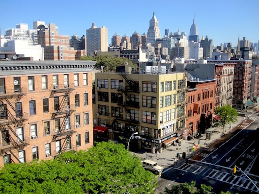
Activity is most effectively created through commercial units on the ground floor. The greater the concentration of narrow storefronts — each with their own entrances and shop windows, the greater the activity will be. Storefronts also adds a visual texture that is greater than what the architecture alone can do.

On streets that don’t have the traffic to support commercial services (because in any neighbourhood, not every street can), activity can be created through a fine grain windows and entrances. On residential streets, the “soft edges” between private and public space — porches, stoops, small front yards — give residents of the buildings a place to relax and socialize, or carry about tasks: gardening, or shovelling the walk.
Buildings should be able to adapt over time
Cities are continually evolving, and neighbourhoods change over time based on any number of demographic and economic shifts. Smaller-scaled mixed-use buildings can become anything: a space that housed a typewriter store in one century can just as easily a vegan cafe the next. Interior spaces should be small and flexible.

Parking garages cannot be easily adapted, and unless there is a future demand for a multi-level indoor roller rink, a Pentecostal mega-church, or the world’s largest dollar store, massive buildings like the Winnipeg Convention Centre will not be easily adapted, either.
There is a need for large buildings, but there should also be a strong, healthy mix of smaller, more adaptable ones.
***
Potential development of what for decades have been wind-swept parking lots is exciting, but to create a downtown Winnipeg that people (and non-government investment) will be drawn to, we must have design standards that reach a little higher than simply “Not a Parking Lot.”
___
Robert Galston likes to write about Winnipeg, urbanism, and other very, very exciting topics. Follow him on Twitter @riseandsprawl
For more, follow us on Twitter: @SpectatorTrib
