Food should be an experience, not merely sustenance.
Ray Oldenburg coined the term the “third space,” defining the places in our cities that are neither the home nor the workplace. They are the anchors of community life and are essential to foster civic engagement, promote democracy, and facilitate broader creative interaction.
Great ideas have historically been generated and shared at local pubs, coffee shops, and restaurants. This is why I advocate for the thoughtful design and execution of their physical spaces. As with all industrial fit out design, it’s not about buying the nicest stuff you can afford and putting it in a room.
The following were evaluated on the basis of knowing themselves and executing their space to be conducive to human comfort and interaction.
[related_content slugs=”winnipegs-top-5-apartment-buildings-exterior-edition, winnipegs-top-5-architectural-wonders-interior-edition” description=”More from Jaclyn Wiebe” position=”right”]
EARLS, St. Vital
1215 St Mary’s Rd.
Say what you will about Earls, but you have to admit that the Western Canadian chain understands the importance of quality design. Earls Restaurants Ltd. has its own in-house award winning design division, e+ Design and Construction, based at their head office in North Vancouver. Here in Winnipeg, the St. Vital location stands out by having a cohesive design aesthetic that encompasses the exterior structure as well as the decoration and details.
The space is enormous and there’s a lot of design to discuss, but the overarching feature is the execution of 1960s interior design and architecture. We all know the ’60s are so hot right now, and it’s great to see the mid-century modernism influencing today’s designs because it’s simply good design. 1960s elements such as connection to outdoors, use of natural materials, monolithic fireplaces, clerestory windows, pitched roof structures with exposed beams, and open concept spaces (with zones/rooms defined by raised or sunken floors) are all techniques employed at this location.

The architecture and interior design are timeless and modern, and while the space feels fresh and contemporary, the classic choices of materials aren’t at risk of looking dated and tacky. This is a good move, because if your company is going to spend at least a million bucks on one restaurant, it would probably be a good idea to spend it wisely and not have to renovate in five years.
The most dramatic interior feature is an enormous 3000lb Edison bulb light fixture, dimmed to the perfect level, adding a soft glow and a subtle sense of enclosure over the central dining area. (While the Edison filament bulb look is a lot more 2010 than 1960s, you could easily switch out the bulbs with simple round globe bulbs and you have instant mid-century light fixture facelift for very little cost.)
They also understand connection to outdoors with sliding glass walls that flow out from the lounge onto expansive fire-lit patio spaces. Good call, Earls. Now if only you didn’t love parking lots so much.
CONNIE’S CORNER CAFE
967 Main St.
What restaurant design list would be complete without a quintessential family diner? Connie’s does it best with a bright atmosphere and a design bursting with personality that was allowed to evolve over many years. Even if you aren’t a fan of santa fe wallpaper borders and oversized dream catchers, you wouldn’t dream of criticizing the decorating because it’s immediately evident that you’re a guest in someone’s home. It seems everything has a story in this place, from the photos of Connie’s family vacations, to the many autographed photos of celebrities and musicians whom you had likely forgot existed. Music is a big part of their lives, and you can often find locals plugging the colourfully luminous jukebox to hear country classics.

Connie’s stands out as unique success compared to other diners because the physical layout contributes so well to the experience. The long bar-style-seating counter faces a small TV, a row of chrome tabletop jukeboxes, and a window into the kitchen with the perfect amount of separation so Connie can chat with the regulars while working the grill. Whether you come solo or with the whole family, there’s not a bad seat in the house.
UNBURGER
472 Stradbrook Ave.
Unburger is a great example of a cohesive branding scheme, unifying graphic design and interior design. Their visual aesthetic parallels their gourmet-meets-casual food offerings: fresh, appealing, and fun. The dining room is bright and modern, with punchy hits of bold red and black text in a trendy Trade Gothic typeface. The plyboo (bamboo plywood) that was used for the benches and countertops brings natural textures into the space to offset the bright white walls.

There are no secluded booths or padded armchairs, a design approach made popular by fast food joints that subconsciously reminds customers that this is a place to grab a quick bite and move along. In this case that’s a good thing, since you can always find a seat without a wait, and you aren’t subject to masses of loitering teenagers as tends to be common in other affordable Village eateries.
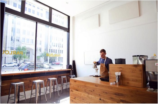
PARLOUR COFFEE
468 Main Street
Photo credit: Matt Sawatzky, http://www.mzsphoto.ca/
Parlour is well-branded, well-executed, and well-loved by those who know good coffee. This locally-owned Main Street shop is a great example of modern minimalism done well. I often hesitate to use the words modern minimalism with my clients because it conjures up images of sterile lifeless environments. While sterility may have its place in the design world, (hospitals, maybe?) a local coffee shop needs a bit more… humanity. Parlour’s monochrome palette and lack of superfluous adornment bring serenity rather than sterility when paired with textures of reclaimed wood, burnished metal, and plaster mouldings.

The existing building and its traditional large-scale chandelier create the perfect backdrop for the modern lines of the well-crafted coffee bar and metal stools. The space is too small for tables and is often packed with people, but never feels cramped. The function and flow of the small room works very well, demonstrating that more space is not as valuable as well-used space.
RAE & JERRY’S STEAKHOUSE
1405 Portage Ave.
Rae & Jerry’s has cemented itself as one of Winnipeg’s iconic establishments, offering an experience straight out of the bygone mid-century era. What restaurant design list would be complete without it? Following the Second World War, a prominent Winnipeg businessman and philanthropist named John Draper Perrin helped to boost the post-war economy by providing venture capital to new businesses – among these were Rae & Jerry’s and CJOB. The rest is history.

The interior is filled with textures that successfully create intimacy and inspire the romantic fantasy of stepping back into a time of glamour and elegance. That is not something that is easily accomplished, and speaks to the authenticity that they have retained over the years. Deep red seating and swaths of dark stained wood, punctuated by square recessed lighting and exposed ridge beams work together to harken to the lushness of early mid-century style.
HONOURABLE MENTIONS:
Mondragon
Boon Burger on Sherbrook
Peasant Cookery [lounge]
Bailey’s [lounge]
Palm Room at the Hotel Fort Garry
McDonald’s in St. Boniface (strange but true)
—
Jaclyn Wiebe is the co-founder of FIRESIDE DESIGN BUILD INC., a Winnipeg based full-service design build company with a focus on custom residential renovation: www.firesidedesign.ca.