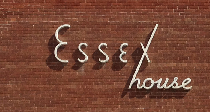
Some of the most architecturally banal apartment buildings came out of the 1960s.
That being said, I firmly believe that a building is much more than a pretty face. While their facades are non-descript, these brick boxes fit very well into the quiet tree-lined streets of our older residential neighbourhoods and busy commercial thoroughfares alike, providing much-needed affordable housing and residential density.
[related_content slugs=”winnipeg-typography” description=”More Winnipeg typography” position=”right”]
With regular care and maintenance, their modern lines and durable brick veneers result in a dare-we-say timeless aesthetic. (Check out Silver Heights on Portage for a good example).
I digress.
What’s particularly interesting to note is that the signage on many of these minimalist tenements is highly stylized on boards of antique signs.
[related_content slugs=”top-5-winnipeg-restaurant-interiors,winnipegs-top-5-apartment-buildings-exterior-edition, winnipegs-top-5-architectural-wonders-interior-edition” description=”More from Jaclyn Wiebe” position=”right”]
Perhaps the original developer wanted some level of artistry and character to set their project apart from the competitor’s building just down the block? And why were graphic design and architecture so different during this time period? While architects embraced modern minimalism, graphic designers favoured serif fonts and custom scripts.
Here’s a few of our favourites:


(I’m also curious to see if anyone is able to name the streets where each can be found. There’s 2 freebies.)
—
Jaclyn Wiebe is the co-founder of FIRESIDE DESIGN BUILD INC., a Winnipeg based full-service design build company with a focus on custom residential renovation:www.firesidedesign.ca.
